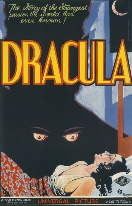
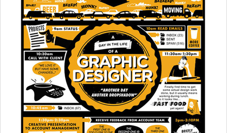
Horror movies have been around for about 120 years. Things have changed since Georges Méliès’s The Haunted Castle (although maybe not that much), not just with the movies themselves, but with the way they’re advertised, too.
Movie posters (usually featuring what’s known as “key art,” the singular image that is the foundation for a movie’s marketing campaign) have been around since the beginning of cinema. Many of the earliest have been lost to history, due to extreme wear and tear. Before the advent of television, movies toured the country from theater to theater for months, sometimes years, and the lobby posters naturally followed along with them.
They’d get torn, dirty, faded or worse, until the distributor would simply throw them away.
Still, collectors managed to rescue some of the extant film posters and restore them. Since it’s October, we thought we’d take you through a historical tour of the best (and a few of the worst) horror movie posters of the past decades....
Via
Jeff Domansky


 Your new post is loading...


Agree and disagree with some of these trends. The bright colors trend seems obvious, but not when you factor in mobile first. Mobile doesn't handle gradients well thus the great flattening of images into more traditional "web safe" colors. Mobile requires simplification across the board images included.
That is NOT to say arresting images don't matter. Arresting images matter more than every since your content must cut through a mountain of clutter. If you're using standard stock cut luck with that "cutting through the clutter" thing.
Better to find arresting images like the one that got my attention long enough to read and scoop this post :). Marty
Marking basically, implies the way the organization logo and hues have been utilized to depict its picture to the outside world. It engraves the item you offer in the psyches of would be clients. It really implies that when one sees these specific hues and outline logo, the principal thing is to recall your image administrations and items. Letterhead Design Services